Deep Baltic logo mastermind Lewis McGuffie explains the inspiration and thought process behind the design
Deep Baltic is set in a typeface called Albertus. This British design, originating in the early ’30s, was modelled on a wood-carved lettering. The letters have the look as if sharp blade cuts of a knife on a robust surface have whittled out the terminals, counters and serifs of each letter, giving the overall impression of a naturalistic composition, like creeping ivy or a scattering of crispy autumnal leaves have found their way through your window. Personally, I feel the letterforms have a close connection with the work of William Morris and his early-modernist ideas of natural beauty in the contemporary world.
![]()
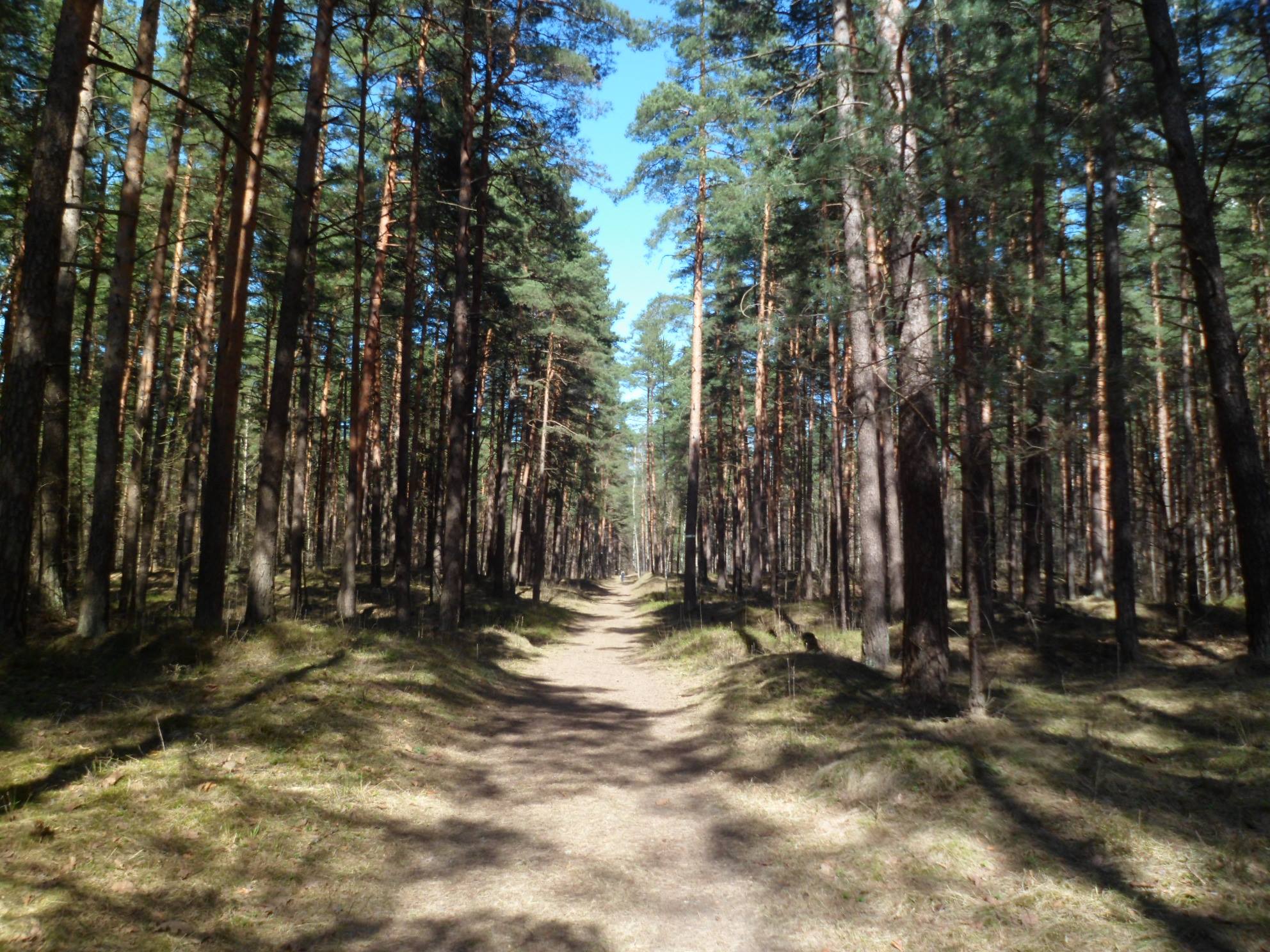
It is this spirit that I feel captures the Baltics – the abundant nature of the region and the impact the seasonal changes have had on the people and the culture that so define the place. So with the lettering for DB I wanted to capture the feeling of a community at large that celebrates clear and rational thought, yet where chopping wood for the winter can still be a necessity to get by.
Lewis is a British graphic designer based in Tallinn, Estonia. He works mainly with typography, lettering and traditional sign writing. More of his work can be found at www.lewisdoessigns.com